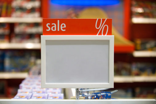
Having appropriate signage plays a huge factor in a store’s success, so it’s important for managers to understand how signs can impact sales and your bottom line.
Because customers’ time is valuable, it is exceedingly important to make signs visible and to clearly state what is being sold. Posting signs at eye-level can help. This includes near countertops, by rest areas and near exit and entry points of your store; anywhere customers will be sure to see them. Also, be absolutely certain that your signs are differentiated from surrounding material. For example, to grab customers’ attention you may want to add a border to your signs, since customers will read the signage 26% faster than signs without borders, according to Pennsylvania College of Optometry (1). Key information can be presented in a second color, which can increase customers’ retention by 78% and generate a greater response (1).
Signage containing designs that distinguish individual letters offer better readability. Though black text is best, tests have concluded that yellow letters on a black background or black letters on a yellow background are the easiest to read, especially when placed at a distance (1, 2). Also, multicolored words or text should be avoided if you have several colors in one background graphic. The words and text will clash with your graphic, which may prevent you from communicating your message in the clearest way possible (2).
Although the next category may seem like a no-brainer, clarity is definitely worth mentioning. While you may be tempted to put tons of info on your sign, you should refrain from doing so. Shoppers need to know why they should purchase a product. The more information you throw at customers on signs, the more likely they are to be off-putting or to convey a muddled message (3). A great way to decide if you can forego some verbiage is by analyzing the text’s relevancy. Do your customers really need to know all the information at this time?
Suitability of your signage is important to consider because a sign’s shape should fit the message being conveyed. Case in point: if you opt for using long rows of text in your sign, then a rectangular sign will work best because it can hold all of the lettering. The same rule holds true if you choose short rows of text; your sign choice should be reflected accordingly (3). WF
References
1. FASTSIGNS International, “Effective Signs,” www.fastsigns.com/LearningCenter/DesignTips/EffectiveSigns, accessed July 22, 2011.
2. Rainbow Sign & Banner, “Design Tips for Effective Signage,” www.rainbowsign.net/design-tips/design-tips-for-effective-signage, accessed July 22, 2011.
3. Sign A Rama, “General Design Tips,” www.signaramachandler.com/info/category/0/article/4901, accessed July 22, 2011.
Published in WholeFoods Magazine, September 2011


