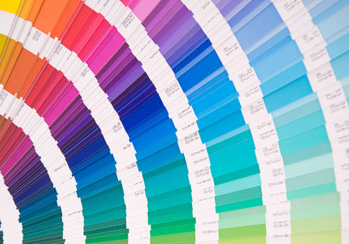
Color is more than a visual element; it’s also an important psychological motivator. “We react on multiple levels of association with colors—there are social or culture levels, as well as personal relationships with particular colors. You also have an innate reaction to color,” Leslie Harrington, executive director of The Color Association of the United States, told The Huffington Post in a November 27, 2011 article. “As you get older, you become much more conscious of those learned reactions than the innate ones.”
But how does this relate to your store? Tuning into color psychology can have many benefits in a retail setting.
Passionate red. Red is one of the most complicated  colors, according to Harrington. Putting aside its romantic connotations, storeowners should use red to call attention; an ideal color for banners, flyers, bulletins, etc. Red is energizing and increases attention and vigilance. Additionally, because of its heart pumping and blood pressure-increasing qualities, red also causes people to react with greater speed and force, making it a color that may encourage consumers to shop.
However, if red isn’t your style, orange is a viable substitute to further stimulate enthusiasm and excitement. “Orange is a much more casual, active color,” said Harrington. “It’s big in active wear, whereas red is more sophisticated.”
Not-so-mellow yellow. Ever wonder why the traditional rain jacket is yellow, a color that deeply contrasts with its intended murky atmosphere? Maybe its purpose is to brighten your day, visually and emotionally. This optimistic color is known to engender hope and jubilance, while it also stimulates memory, awareness and perception. Yellow could be that beacon of hope for any ill customers, and may be the perfect color for the medicinal or supplement areas of your store.
Calming green. Green is connected with nature. And indeed, “there is some tentative evidence emerging in literature showing that green is relaxing because it is associated with growth and nature,” said Andrew Elliot, Ph.D., professor of psychology at the University of Rochester, also in The Huffington Post. Like a blooming plant, this color goes hand in hand with new birth and growth, a perfect option for any maternity-related items at your store. Also, nature’s color has been proven to reduce anxiety and foster feelings of self-control. Perhaps try out green in an area dedicated to sleep aids, anxiety reducers, teas, etc.
Friendly blue. Psychologically, blue induces opposite effects than red. Similar to green, blue is a color often found in nature, such as in the sky and the ocean, which could be a factor for its calming and peaceful effects. Uniforms may work well in blue because of its inviting qualities. “Blue is associated with trustworthiness, strength and dependability,” said Harrington. “Hence the blue power suit, it projects [just] that image.” Not only will blue uniforms (or walls) appeal to your customers, but it can also promote various risk-taking activities in certain situations. Perhaps, for example, purchasing an item a customer normally wouldn’t buy.
Whether you are remodeling your store or creating new signs or banners, keep these colors in mind. Color psychology could help improve your store’s atmosphere, purpose and, most importantly, income. WF
Published in WholeFoods Magazine, November 2012


