An optimized redesign generates an average 5.5% lift in revenue, according to research by Nielsen. Still, 90% of redesigns fail to deliver meaningful sales improvement and 50% harm brand perception.
“There are a lot of brand strategies to help retailers drive category sales through effective package design,” says WholeFoods contributor Daniel Lohman, CPSA, a consultant on category management to natural products companies. “Think of most retailers’ private label and how the packaging is consistent across the entire store. They use the packaging design and technology to develop familiarity and easy-to-find products.
“Brands equal trust,” he adds. “The packaging needs to convey that trust.” That is why a bad redesign can spell disaster. “There are a lot of stories where brands change their packaging abruptly and the brand fails — even when it was growing prior,” Lohman explains. With that said, wise updates are crucial. “Packaging refreshes help keep products from getting stale,” he says. “It is sometimes more important than updating the ingredients.”
The TrendsMacro consumer trends like on-the-go living and the rise of ecommerce are fueling unprecedented changes in packaging considerations.
“Our single-serve business has doubled in a 15-month timeframe because of the on-the-go lifestyle,” says David Gray, president, Green Seed Contract Packaging in Batavia, IL. Gray has geared his operation for efficiency in producing flexible packaging as a differentiator. Think pouches and sticks. He notes that ecommerce is also leading to more packaging as 3-pack single serves increase in use over the standard 12-packs for brick-and-mortar. “It’s a paradox,” he notes, counter to the desire for more eco-friendly packages.
“Small companies are competing like never before against large ones,” Gray adds. “We’ve seen a shift in production go from long runs to short runs.”
While the basic functions of product protection and containment remain paramount, things like usability and communication are equally essential. Ergonomic packaging can make the consumer feel good every time they use your product and labeling can reinforce important messaging.
Changing demographics represent an opportunity, notes Josua Schwab, project manager at Bosch Packaging Systems in Germany. Already, today, over half (54%) of those over age 65 use foods and drinks to support active and healthy lifestyles, he says. And one in six will be over 65 by the year 2030.

“The aging process can only be held at bay for so long,” Schwab says. Sight and hearing may become a little less sharp and fine motor skills can deteriorate with increasing age. These factors should definitely be considered in terms of pack style and packaging design. Simple opening aids and a clear and easily legible packaging design are an advantage here.
“One third of consumers worldwide read label information very carefully. For this reason, a legible font size should be considered for important ingredients and nutrition information. This does not necessarily mean that packaging should be unappealing or old-fashioned — seniors have no wish to feel older than they are!
“Packaging must be easy to open and to divide into portions, as well as being lightweight and robust for easy handling,” he continues. “In addition, packaging must keep contents fresh, as seniors go shopping less frequently than millennials, for example. Food safety is also important to the older generation. Alarmed by continual reports about food scandals, it is not only the ingredients but also the hygienic manufacturing and packaging processes that are important.”
Anthony Gentile, director of marketing for Saline, MI-based XelaPack, says he is seeing more companies move toward a wide mouth bottle for thicker products like coconut oil and ghee butter as well as liquid ingestibles. It’s just easier to use.
“As companies grow more environmentally conscious, we have continued to see a rise in requests for 100% recycled paper options,” Gentile adds, noting there are trade-offs. “By nature, these paper options are more coarse and less suitable for special types of printing such as metallic, 4-color process, difficult screens, and special varnishes.
“Many companies are embracing these recycled options, knowing that the materials do lend themselves better to simpler designs, and using that aesthetic as part of their overall product image or statement.
“With the economy having grown stronger over the last couple of years, and many companies in the natural realm growing significantly larger or being purchased by larger companies, there is more available money today for research into new materials, new processes, and new technology. I see this point in time as providing a huge opportunity for innovative people and companies to work together to improve packaging function, sustainability, cost and productivity,” Gentile adds.
“The whole natural food and supplement category is maturing and there are dynamics that go along with that — not to mention the major changes in how people are buying products with ecommerce and on-demand,” says Liam Hawry, director of industrial design for packaging at Studio OneEleven, a division of Berlin Packaging in Chicago, IL. “In emerging categories like functional beverages where it’s crowded and brand owners are reaching a threshold where they’re moving from startup to being an established player, they realize they’re being lost in the shuffle.”
The package is about storytelling, Hawry emphasizes. For Nature Nate’s Honey, StudioOneEleven recommended streamlining the number of SKUs to just three and updated the bottle design to look like a honeycomb (see “Tale of Three Honeys,” page 32). “They are exploding in terms of distribution and sales,” he says. “The proper way to look at it is to understand the context at the category level and the shelf level. It really has to do with what is around it. Trying to differentiate, being category appropriate while also being memorable is the balance.
“There’s a lot of work being done in right-sizing dispensing and measuring and pouring and scooping,” Hawry adds.
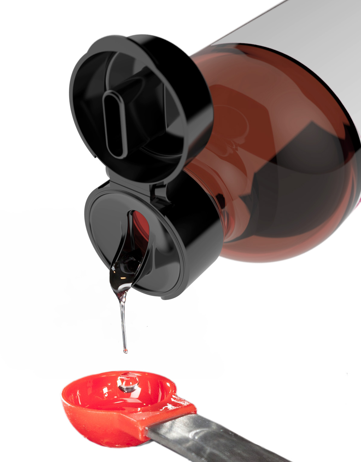
Think of products like fish oil that traditionally have been measured with a teaspoon that’s very difficult to pour from a glass bottle. StudioOneEleven created a new dispensing system using a plastic bottle and pour cap that will roll out soon (see Figure 1).
 The Influence of EcommerceBrandless, the new San Francisco-based venture-backed ecommerce company offering all products for $3, is not competing on a shelf but has also told a story through packaging by extending its core value system to its visual look and feel.
“We started with a focus on Just What Matters, which is a filter for everything we do,” said co-founder and CEO Tina Sharkey. “It begins with offering products that match your values, preferences and requirements (like organic or gluten free) and extends to simplifying our packaging to clearly communicate what matters to you. We approached the design of our packaging in collaboration with Red Antler to create a simple visual system that distills the most important information. We’ve taken the concept of UI/UX that works so well in the digital world and applied it to the physical world. We’re getting rid of the brand clutter and starting fresh with white space. What we pull into that white space are the key attributes people are looking for in a specific product. Today that applies to our everyday essentials collection, but it’s a system that can scale across anything we do.” (Click here for a full interview with Sharkey.)
If you sell on Amazon Marketplace and choose to use the Fulfillment by Amazon system, be prepared to satisfy the packaging requirements. Most critical is the product’s ability to sustain a 3-foot drop test without the contents of the container leaking or spilling. The drop test consists of five drops: flat on base, flat on top, flat on longest side, flat on shortest side, and on a corner. There are also requirements for pump-top dispensers. (Full requirements are available on the Amazon site.)
RegulationsRegulation continues to play an important function in all food and supplement packaging. “StudioOneEleven gave up a designer position we had open to hire someone with a regulatory background in the designer group. We saw that as a critical need in our customer base,” Hawry says. “Both with the U.S. Food and Drug Administration and the new nutritional panel, there are also some general shifts focused on more risk-based procedural guidelines. There has been historical trending and recent activity around goal-oriented, risk-mitigation-oriented parameters.”
Rather than providing a host of hoops to jump through, there’s a shift toward putting the burden on brand owners to understand the likely risk.
“Another thing we’ve seen is people moving towards the bio-based PET where they put the indication for plant-based resins on the label so the bottle material is sort of conceptually similar to the product,” says Hawry.
PET plastic bottles made from 100% bio-based materials are the aim of a joint effort of Danone, Nestle Waters and Origin Materials, called the NaturALL Bottle Alliance. Its goal is to make the technology for a 100% renewable and recyclable bottle available to the entire food and beverage industry “in record time,” with an initial goal of 60+% bio-based PET by 2018.
SupplementsNutritional supplements are a growth category and chewable gummies are the primary growth driver expanding into all supplement categories, notes Sue Benigni, nutraceutical category manager for Comar, a specialty packaging and dispensing provider based in Voorhees, NJ.
“Gummies are almost exclusively packed in generic PET, allowing for clear visibility,” she says. “It’s also important to have child-resistant packaging because they look and taste like candy.” Benigni anticipates more regulation focused on gummy safety and children as the category continues to expand.
Shifts in the demographics of protein powder users are also leading to great packaging shifts in that area, she says.
“Powdered proteins are going more mainstream and more casual athletes and women are using them as meal replacements. They don’t want to lug around giant canisters or pay that much for a large jug (which can go for $40.) I’ve even seen scoop your own protein powder,” says Benigni.
Cost is a key factor in a commodity-driven packaging market. Optimized production can drive down costs/prices (e.g. lightweight bottles produced on state-of-the-art equipment). Blister packs are another popular form of packaging because they are easy to keep track of, provide directions on the immediate package, and offer pre-measured dosages, Benigni says, but “Plastic bottles, canisters and jars are the preferred format for supplement packaging. Plastic bottles can contain nearly all types of liquid, solid and powder products and offer moisture, vapor and light protection, design flexibility, recyclability, and safety.”WF
Published in WholeFoods Magazine October 2017


