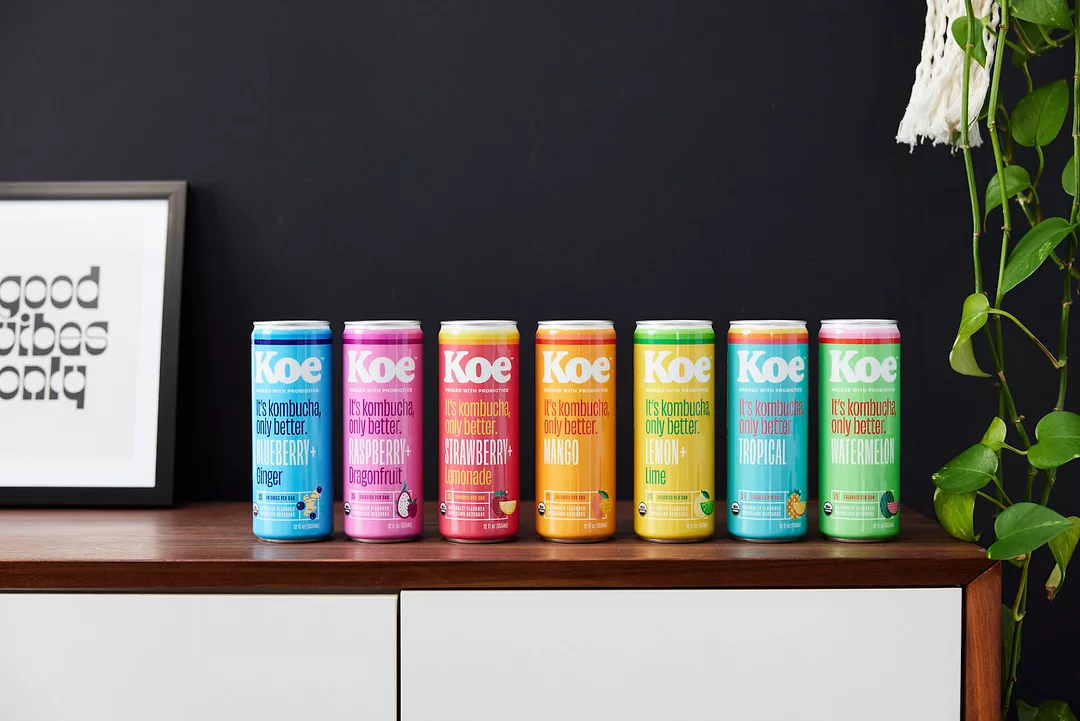
The new brand architecture embraces trends in fashion, art, and pop culture, showcasing bright colors, retro striping, and geometric fruit illustrations, the press release says. It was developed by design firm Turnstyle, which looked to convey Koe’s relaxed SoCal vibe.
The altered recipe adds a 250%+ dose of the recommended daily allowance of vitamin C.
“As demand for Koe has continued to climb, we wanted to scale the right way with branding that better reflects the beverage itself—bold, vibrant, innovative, and fruit-forward,” says Louisa Lawless, Chief Strategy Officer at Stratus Group. “Our ultimate goal is to create products that make it easier to be healthier. Koe is definitely not a soda—it is packed with nutrients and real ingredients. But what keeps consumers coming back is the taste,” added Lawless. “We decided to lean into that with artwork that’s fun, ownable, and authentic to our LA roots. We even dropped the all-caps and umlauts from our name to simplify and focus on what makes Koe so much better—our flavors, benefits, and convenient cans.”
Related: Humm Kombucha Secures $8MM Line of Credit Mediterranean Food Company Rebrands Nutiva Rebrand Inspired by the “Vibrant Energy of the Sun”
The rebrand is timed to hit during spring 2022 resets, at which point distribution will increase from roughly 45,000 locations nationwide to approximately 60,000 locations.